How to Create a Design System
Using Angular, Storybook, and Typescript

1. Install Node and NPM
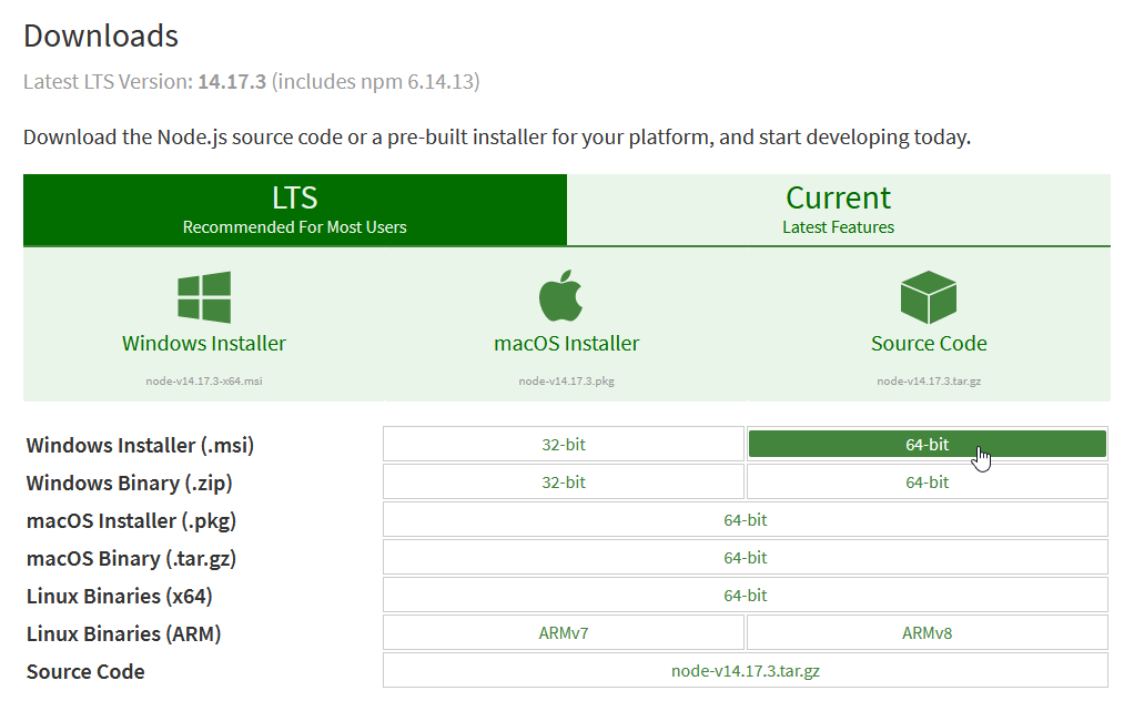
It's pretty easy. Just head over to Node.js and download the correct installer based on your Operating System.
2. Set Up a Development Environment
Navigate to a location where you would like your workspace to live. In my case,
$ cd ~/devCreate an empty npm project. This will generate a package.json file and allow us to install Angular-CLI.
$ npm initNext, install Angular-CLI globally:
$ npm i -g @angular/cliIf installed this way, you can simply type, for example,
ng serve. This is the approach I recommend. Alternatively, you can install it for just this workspace by runningnpm i @angular/cli. If installed this way, any commands must be executed by npm:npm run ng serve.Generate an empty angular project:
$ ng new <projectname> --createApplication=falseThis generates an empty angular project that doesn't include any libraries or apps.
(Optional) - Delete the package.json created in the
~/devdirectory, or wherever your project workspace lives. It will not be needed for this project.Generate a 'storybook' library and initialize Storybook
 $ cd <projectname>
 $ ng g lib storybook
 $ npx sb init
This will add a
.storybookdirectory that contains some configuration options for Storybook.Configure angular.json to work with Storybook
With the default config generated by
ng g lib storybook, Storybook will produce an error. If you want to see the error, go ahead and runnpm run storybook.Assuming your library name is 'storybook' like mine, your angular.json file should now look like this:
 {
     "$schema": "./node_modules/@angular/cli/lib/config/schema.json",
     "version": 1,
     "newProjectRoot": "projects",
     "projects": {
         "storybook": {
             "projectType": "library",
             "root": "projects/storybook",
             "sourceRoot": "projects/storybook/src",
             "prefix": "lib", // <--- This can be changed to anything you like. It will generate components with selectors like "lib-button"
             "architect": {
                 "build": {
                     "builder": "@angular-devkit/build-angular:ng-packagr",
                     "options": {
                         "project": "projects/storybook/ng-package.json",
                         "tsConfig": "projects/storybook/tsconfig.lib.json" // <--- This line has to be here for Storybook to pick up the typescript config (without this, you get the error mentioned above)
                     },
                     "configurations": {
                         "production": {
                             "tsConfig": "projects/storybook/tsconfig.lib.prod.json"
                         },
                         "development": {
                             "tsConfig": "projects/storybook/tsconfig.lib.json"
                         }
                     },
                     "defaultConfiguration": "production" // <--- This part is ignored by Storybook in version 6.3.6
                 },
                 "test": {
                     "builder": "@angular-devkit/build-angular:karma",
                     "options": {
                         "main": "projects/storybook/src/test.ts",
                         "tsConfig": "projects/storybook/tsconfig.spec.json",
                         "karmaConfig": "projects/storybook/karma.conf.js"
                     }
                 }
             }
         }
     },
     "defaultProject": "storybook"
 }
Configure .storybook/tsconfig.json
By default, storybook will generate a tsconfig.json file with the first entry being
"extends": "../false"We need to point this to our library's tsconfig file. Here's what it should look like:
 {
     "extends": "../projects/storybook/tsconfig.lib.json",
     "compilerOptions": {
         "types": ["node"]
     },
     "exclude": [
         "../src/test.ts",
         "../src/**/*.spec.ts",
         "../projects/**/*.spec.ts"
     ],
     "include": ["../src/**/*", "../projects/**/*"],
     "files": ["./typings.d.ts"]
 }
Run Storybook
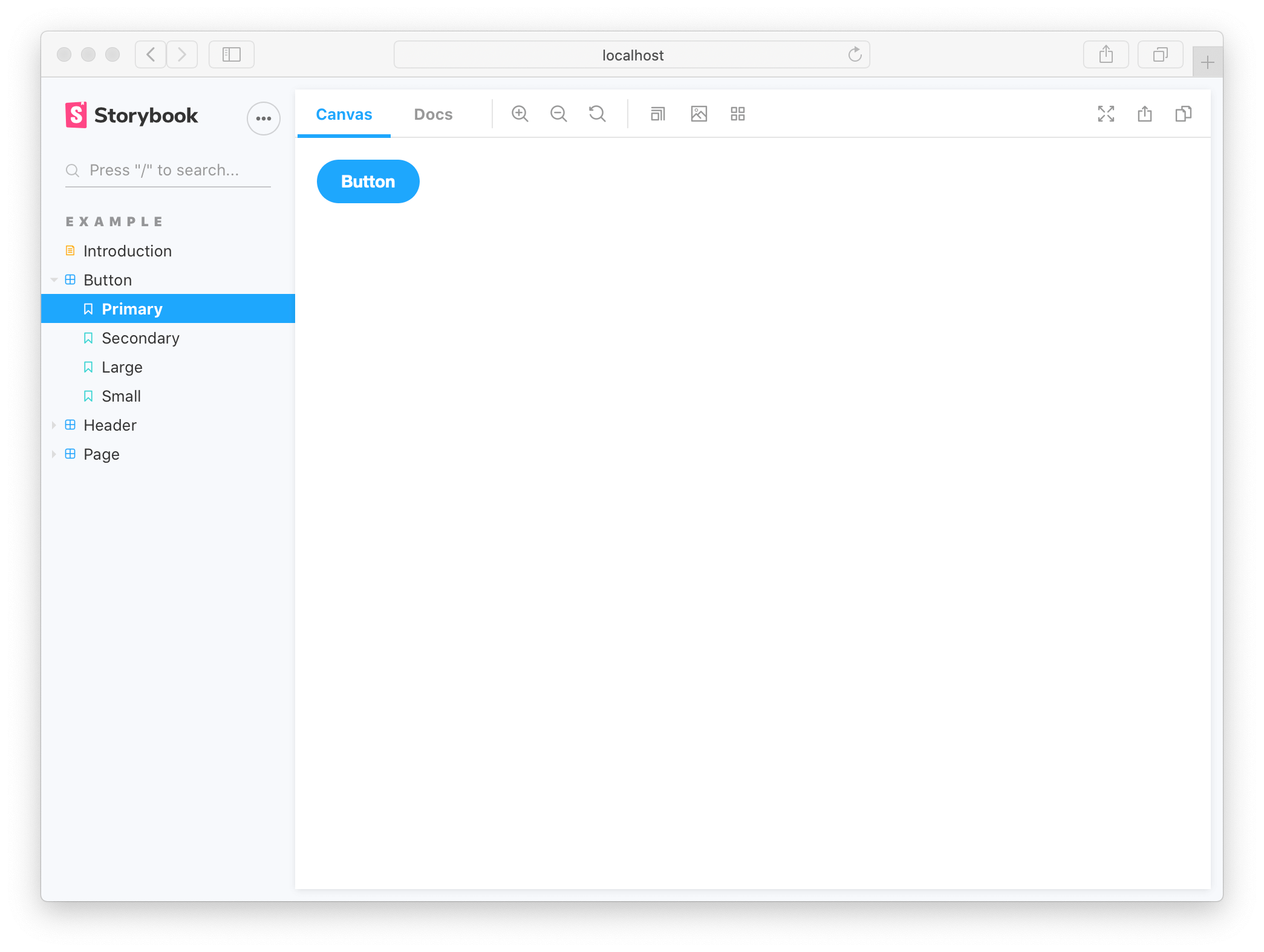
At this point, we can run storybook to view the examples that are installed by default when we ran
sb init.$ npm run storybook
3. Create a Custom Component and Story
Generate an Angular Component
 $ ng generate module input
 $ ng generate component input
This generates several files:
input.module.ts,input.component.ts,input.component.spec.ts,input.component.html,input.component.css. We should go ahead and modify theinput.component.htmlfile to reflect the name of the component.Modify InputComponent's Template and Component
Modify: input.component.html
 <label [for]="id">{{ label }}</label>
 <input [id]="id" [placeholder]="placeholder" [type]="type" />
Optional Modify: input.component.css
 input {
     border: 1px solid rgba(0, 0, 0, 0.2);
     display: block;
     padding: 0.5rem 1rem;
     border-radius: 4px;
     background-color: #fafafa;
     margin-top: 0.25rem;
 }
Modify: input.component.ts
 import { Component, Input } from '@angular/core';

 @Component({
     selector: 'lib-input',
     templateUrl: './input.component.html',
     styleUrls: ['./input.component.css']
 })
 export class InputComponent {
     @Input() placeholder: string = 'default placeholder';
     @Input() type: 'text' | 'password' | 'number' = 'text';
     @Input() label: string = 'default label';
     @Input() id: string = 'default_id';

     constructor() { }
 }
Export InputComponent from InputModule
We need to export InputComponent so that our story can import it correctly.
Modify: input.module.ts
 import { NgModule } from '@angular/core';
 import { CommonModule } from '@angular/common';
 import { InputComponent } from './input.component';

 @NgModule({
     declarations: [InputComponent],
     imports: [CommonModule],
     exports: [InputComponent]
 })
 export class InputModule {}
Write a Story For InputComponent
Create File: /stories/Input.stories.ts
 import { CommonModule } from '@angular/common';
 import { InputModule } from 'projects/storybook/src/lib/input/input.module';
 import { InputComponent } from 'projects/storybook/src/lib/input/input.component';
 import { moduleMetadata } from '@storybook/angular';
 import { Meta, Story } from '@storybook/angular/types-6-0';

 export default {
   title: 'Components/Input',
   component: InputComponent,
   decorators: [
     moduleMetadata({
       imports: [CommonModule, InputModule],
     }),
   ],
 } as Meta;

 const Template: Story<InputComponent> = (args: any) => ({
   props: args,
 });

 export const TextInput: Story<InputComponent> = Template.bind({});
 TextInput.args = {
   ...Template.args,
   type: 'text',
   placeholder: 'Input Text Here',
   label: 'Text Input',
   id: 'input_id',
 };

 export const PasswordInput: Story<InputComponent> = Template.bind({});
 PasswordInput.args = {
   ...Template.args,
   type: 'password',
   placeholder: 'Password Here',
   label: 'Password Input',
   id: 'password_id',
 };
Run Storybook
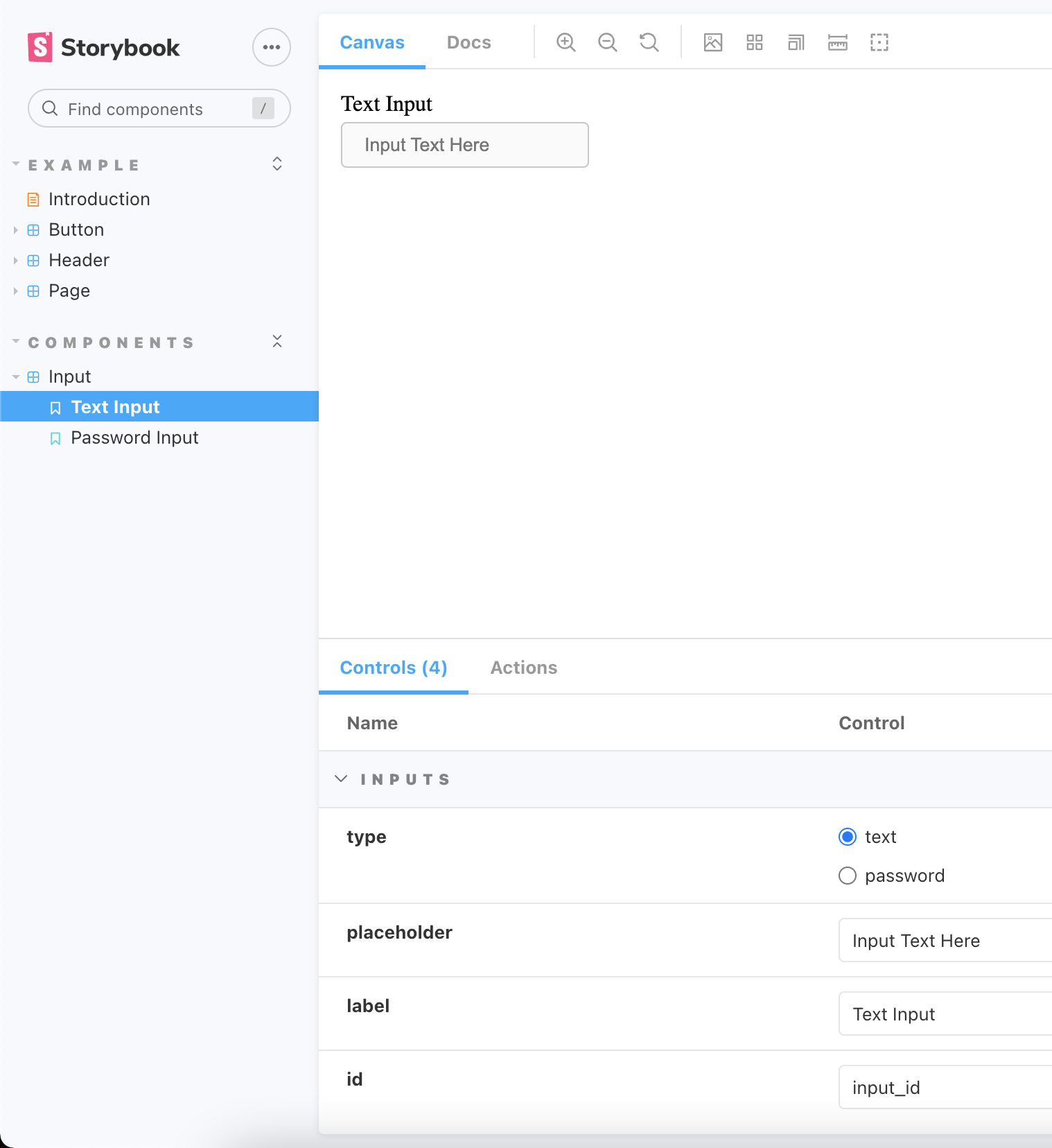
$ npm run storybookThis will take a minute to initialize storybook from your codebase. Once its finished, it will automatically open a browser where storybook is located. It should look something like this:
I hope you enjoyed this guide! Please let me know if you have any questions, and please know that this is only the beginning of creating a Design System. I have more guides to come in the future!